Wednesday 18 March 2009

Evaluation

My magazine challenges forms and conventions of real media products as it has a funkier, edgier appeal to it. There are not many magazines around with this image, as the audience (those who listen to dance music) is not one that is often targeted. This is partly due to the fact that the dance trend has only recently come back into fashion. Although it was around in the 1990’s, it seems that its audience had drifted from it and towards other genres, therefore so did the media. This is part of the reason why I chose such a demographic; because this genre has not been recently developed in the form of a magazine.

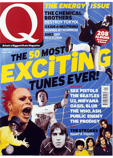
Most of the magazines of today follow one of two styles. Firstly, there are the very polished magazines with clean finishes that have been edited to create a perfect image, which usually have a well-presented and airbrushed artist or group on the cover. Secondly, there is also the more grainy-looking and edgier type of magazines, which often convey a more outgoing sense. Although this is partially due to the music genres being targeted, there are certain similarities within the groups. For example, NME and Metal Hammer attract two very different audiences, however when looking at certain issues, they both share the edgy essence that I speak of. My magazine does not fit into either of these groups as the colours suggest a clean and tidy appearance, however the common connotations labelled to this particular music genre may suggest otherwise.

My media product represents the often-stereotyped youth of today and is offered from a local North London perspective. As stated in the ‘letter from the editor’ on the contents page, the makers of Massive are presented to be 14-19 year olds that all come from the London borough of Haringey. Again, referring to the contents page, there is a faded blue ‘boom box’ on the background of the page, which informs the audience that the magazine is all about music and also narrows it down to particular genres of music. This is due to the fact that a boom box has connotations that propose the idea of loud dance music and hip-hop. Of course my demographic includes those who listen to funky house music, a new style mixture of garage music and pop. This genre is implied by the use of colour and style.

I think that the kind of media institution that might distribute my media product is EMAP, a British media company, specialising in the production of business-to-business magazines. This is because they recently sold many parts of the company and are therefore more likely to be looking for new material to work with. I am also aware that EMAP are capable of distributing successful music magazines as they used to manage magazines like Smash Hits, which ran for over 25 years.

The audience for my media product are teenagers and those in their early twenties. At the very beginning of my project whilst doing my planning work, I had decided that the magazine was going to be aimed at 14-24 year olds. Throughout the course of the term I have developed my product to fit this specification. Thus, the target audience remains as this age group.

The ‘vibe’ given by the front cover is quite outgoing and original. The use of bright colours and the graffiti wall behind the featured group suggest this. The title also suggests that the magazine has been made to fit the needs of this age group as it is written in a very retro and bright typeface. The three girls (T-Starz) featured on the front cover of the magazine are wearing various vivid colours, which in itself attracts a viewer’s attention.

The contents page of my media product continues the idea of contrasting colours as it has a black background with bright blue, pink, yellow and green writing over it. Originally I was going to have a standard white background, but I soon discovered that the writing on the page somewhat blended in with this and therefore it wasn’t a successful choice. My article on the other hand has a slightly more relaxed feel to it as I have incorporated fewer colours and there is lots of empty space to keep the page looking clean and simple.

Throughout the course of this project I have been asked to use two types of software. The first is Blogger, an online blogging website to use as a commentary for my progress; and the second, is Adobe Photoshop, which I used to adapt and manipulate my images. When beginning the project I had recently begun using Photoshop at home. This gave me an advantage as I had already had some practice and time to warm to the technology. Now that I have operated them for a few months I can say that I enjoy using them both. I feel as though I have increasingly progressed with my knowledge of the technologies and do intend to continue using them both in the future.
When looking back at my preliminary task, I feel that I have learnt a lot in the progression from the beginning of the year to the full product. I have spent a lot of time working on the project and therefore have had more practice using the technology. I began my project by doing some magazine content research, which taught me a lot about the industry and what essential aspects every magazine must include. It has also become clear to me what is required specifically for a music magazine, as my student magazine consisted of very different properties.

Thursday 12 March 2009

CD Back Cover

This is the final back cover of the CD that comes free with my music magazine 'MASSIVE'. It includes the track list of music, which would be found in this genre of magazine, a simple image, which also reflects the genre and a selection of bright colours used on the fonts to draw in attention. The CD itself, which can be found inside the case has seven songs burnt onto it, all of which are listed below. 

CD Front Cover

This is my final CD cover after construction on Adobe Photoshop CS2.


CD Cover

These are the five images that make up the front cover of the CD that I have created to attach to my magazine. I chose these particular images to fit around the jumbled text of artist names and other relevant words that are also on my CD cover. The positioning of the images shows that they are interacting with the letters. 


Wednesday 4 March 2009

Final Article

I have posted two copies of my article due to some technical issues I had with uploading certain images to my blogspot. Number one correctly displays the colour of my article and once number two is clicked on, the clarity of my article will be correctly presented.

I chose to write an article in the form of an interview with an upcoming girl group named T-Starz. Again, I chose this layout to follow the bright coloured theme, as it draws in the readers attention. Whereas, the images with accompanying anchor statements introduce a more visual appeal. I constructed the article using Adobe Photoshop CS2. I took all of the pictures other than the one of 'Taylor Daines' and the image with all three girls lying on the floor. This was because I appeared in both of these pictures and therefore was not able to take the pictures myself. 

1)


2)
<-- Click on the image

The font I used for the heading, which is diagonally stretching across the double spread, was chosen because it appears as though it has been stamped. This creates the effect of labeling , which is what I was doing - labeling the page. Conversely, the dripping paint effect was added to show continuity throughout the pages of my magazine. I added a short introduction to the article beneath the heading 'T-Starz'. This introduction consists of a short explanation of the topics that are featured and other general information. 

There are short biographies in the bottom right corner of the double spread, which includes basic information about the three T-Starz. The categories are name, age, status, date of birth, likes, dislikes and zodiac sign. I added page numbers to the article to make it seem more realistic and also made sure that these page numbers matched those referenced in my contents page. The last feature I decided to include was having the subjects names in a bright pink colour to stand out against the teal green. This helps the reader see the structure of the interview and also gives a better range of colour when looking at the piece on  whole. 

Final Contents

This is my final contents page. I feel that this is much improved since my original draft, which was plain and empty. I have included a letter from the editor to make it seem more realistic and also images to break up the text. I also decided to continue with the theme of bright colours, as this represents my target audience as being young, energetic and enthusiastic people.

As you can see, this has been drastiucally adapeted since the first draft of my contents. I have chosen to place the letter form the editor along the top of the page rather than down the right hand side. This was because I have very rarely seent his and I want my magzine to be original and unique. I kept both the design of the word 'contents' and also the blue paint 'blob'; however I decided to develop these ideas by combining them. The 'boom box' on the other hand, I chose to massively enlarge. It now covers over half of the page and is slightly angled to give the piece a sense of dimension. I turned the opacity of the image almost completely down to ensure that all of the text could be seen through it.

1)


2)
<-- Click on the image

After writing the contents I added three images to the page. The first, a photograph of myself, accompanying the letter form the editor. This decision was made due to the research analysis that I had done prior to the development of my magazine. I had recently discovered that a photograph of the editor if often included on the contents along with their few words speaking about the issue. The second image I added was another taken by myself of some of my friends posing as the T-Starz and their crew relaxing on their tour bus. This is an image that I was initially going to use in my article before I noticed that it didn't appear as clear as I would have likes. This was made more obvious to me after my media teacher mentioned it to me in my feedback after I handed in my first draft. The result of this was me choosing to transfer the image to the contents page where it would be smaller and placed in a more relevent place for such quality. The last image I added to the page was one of two male celebrity artists dancing at what appears to be a club. I accompanied this image with the caption just above explaining it and including a page reference.

Lastly, I further developed the page by adding a website address at the bottom alongside a catchy and appealing statement. The reason that I chose the background colour to be black is completely due to the fact that the colours of the text contrased much better with this than on a white background where they were barely visable.

Contents first Drafft

This was the first draft of my contents page. I decided against using this layout for my final contents as it didn't have a very clean finish and also appeared rather empty. It seemed that there simply wasn't enough going on within the frame. I constructed the main body of writing within two columns and included a title at the top of the page with an accompanying logo. The writing in the left column is the actually contents of the magazine and has been written in alternating colours that co-ordinate with those ont he cover. The 'boom box' logo represents the youth subculture that is often stereotyped with this particular genre of music. A letter from the editor also runs down the right hand side of the page, briefly introducing the magazine with some background information, as this is the first issue to be released. The blue 'blob' at the bottom right of the page is a continuation from the front cover of the graffiti theme.

I have posted two copies of my contents draft due to some technical issues I had with uploading certain images to my blogspot. Number one correctly displays the colour of my article and once number two is clicked on, the clarity of my article will be correctly presented.

1)


2)
<-- Click on the image

Final Cover

This is the finished cover of my magazine. To produce this cover, I experimented with various colours, fonts and layouts. I then chose the best aspects of each and began to put them together to form the final piece.


  • I included a teaser along the top of the cover in a white font reading, 'The Untold Story of Lady Sovereign. What Really Went Down In The USA?'. This was to draw the reader in and tempt them into buying the magazine.
  • Another feature that I incorporated was the words 'Issue ONE' in a teal green that matches the colour of the jeans on the model on the left. I presented this information in the form of a polaroid photograph, as this relates to the idea of fame and always being in the public eye - the celebrities on the cover. Just below this text is a caption informing the audience of the month that the magazine was released.
  • I integrated a list of feature artists that would be either interviewed or reported on within the magazine. This was to give the reader an idea of which genres the magazine is aimed so they can decide for themselves whether or not they fit the demographic.
  • I shaded the top right hand side of the page, again using Adobe Photoshop CS2 to make the white and pink writing stand out more due to the contrast. Originally the words 'in the USA' were not very visible and therefore some adaption was needed to fix this. I created the shading by producing a veneer on a separate layer and later turning down the opacity to show both the shading and the words.
  • I added basic information about the magazine on the ticket to inform the reader about what they can expect to find among the pages inside. The reason I chose to place this informartion on the ticket was because I wanted to create the effect of a realistic concert ticket, which would naturally include writing.
  • Lastly, I placed a price on the bottom right of the page to ensure that my music magazine fitted the common framework of a real life version.


<-- Click on the image


I am very happy with my final design as it meets the initial specification of which I set myself at the beginning of the course. This brief included brightness, very contrasting colours, and outgoing sense and a photograph that would get the viewers attention. After reviewing my work, I feel as though I have successfully achieved this.

The Ticket

The next step was including a ticket onto my cover. I did this by taking a picture of an old cinema ticket I had in my house and transferring the image onto the computer. Once I had done this, I minipulated the image on Adobe Photoshop CS3 and removed the unnecessary content, such as the film informatin and cinema details. At this stage, I also introduced a subheading. Although I had not yet come up with an aduequate catch, I decided to go forward with experimenting with it's font and colour. Eventually I came to the decision of using a blue arial font for simplicity purposes.

<-- Click on the image

This is the original ticket that I used on the front cover of my music magazine. I chose this one above others as it was slightly creased, which gave a more naturalistic effect, thus making it look more like a real concert ticket. Also, the bright orange colour co-ordinates with the background image I have on my cover. This adds to the eye-catching and contrasting scheme that I was initially aiming for.

<-- Click on the image

First Draft

Once I had decided on an image, it was time to experiment with fonts and a title. As the music genre I had previously decided to focus on was dance music. I chose to use the word dance for experimenting purposes. I played with various fonts, colours and sizes and eventually came up with the appearence below. I minipulated the colours and shading in the background image to excentuate and tone down certain aspects.

<-- Click on the image

Mock Up

Before I began the adaption of my cover, I made a mock up version of what it may look like. As you can see, I did not give the mock up a clean finish. This is because the main reason for my mock up was to experiment with colour, layout and spacing. From this example, it became clear to me that it is very rare to find a landscape magazine. Also, I noticed that spacing out the models like this didn't leave much room for any text content. These aspects gave me a better understanding of what my cover may end up looking like.

<-- Click on the image

Tuesday 27 January 2009

The Cover

I had many ideas for the front cover of my music magazine. One of these was to have a group pose in front of some graffiti. After analysing each of my ideas, I decided that this was my favourite and most suitable for my chosen genre and demographic. Next I chose to develop the idea before beginning my very own photo shoot. I invented a 3-piece girl group consisting of myself and two of my friends. I chose to dress my models in extremely bright colours with quite a funky attire. This again reflects the personality of my chosen audience. Once I had sketched out a few poses and overall layouts for my cover I was ready to begin the actual shoot. Luckily for me, I live very locally to Alexandra Palace, which has a well-know skateboarding park.

On the walls of this skateboarding park are various graffiti designs sprayed by the general community. I was already aware that this was there, however I was not entirely sure about its present appearance as the walls are constantly being re-designed. Taking this into consideration, I walked up to the location to see if it was suited to fit the design brief for my cover. I was pleased to discover that it was bright, colourful and full of style. Next, I got two of my friends to accompany me to the location and asked my sister to take some photos. Although it was her to take the photographs the shoot was dircted by myself. I was very happy to find that the shoot was a success as I was left with a selection of winning photographs to choose from.

After analysing each photograph, the one that I decided to stick with was a capture involving all three of us positioned at different heights, creating the visual affect of levels. I tranferred this image to Adobe Photoshop CS2 and begun my editing. After adding an initial heading, title of magazine and other aspects of text to the cover, I re-assessed it and started to develop the overall image. I used guidelines to ensure the individual sections were all in line with each other or lined to some significance and with the use of layers, made the fragments ordered and placed correctly. I tried various layouts and designs for my cover and finally after a long and hard process, created the look that I was aiming for.

Wednesday 17 December 2008

Diagram

This is a diagram representing some of the early choices I made regarding my music magazine project. My main catergories were audience, colour, genre, article ideas, text, magazine names, price, potential publishers, cover ideas and release dates.

<-- Click on the image

Wednesday 19 November 2008

Magazine Research

At school, my class and I deconstructed a selection of magazines to uncover the different features that appeal to various audiences. We found out that the precision needed to focus on one particular demographic is very detailed, as one must consider multiple features including age, gender, interests, class, social status, music taste, appearance, dress sense and even average income. Something we discovered during the course of this research was the music magazine industry's failure to maintain a sufficient and steady number of customers. Statistics show that sales in the area have immensely plummeted over the last decade and are failing to regain these customers. However, certain magazines such as Future Publishing's 'Metal Hammer', has been doing evidently well considering the recent circumstances. Whereas music magazines like 'NME' are not doing quite so well. Also, even the countries biggest selling music magazine 'Q' lost a deposit of 13.8% of its readership in the alf year. The most failing music magazine last year was Bauer's 'Kerrang', which posted a 27.9% drop in readership by the end of 2007. This downfall has resulted in an increase in magazine prices, which therefore can also lose customers. As an attempt to regain some readership, Bauer's 'Q' announced a complete re-design of the cover and magazine.
<-- Click on the images

'NME' however, decided to take a different approach to increasing company income. The music magazine invested in re-launching their mobile website where the customers can now search for upcoming gigs using the gig guide, be the first to know about celebrity interviews and get discount to its Club NME nights and music and video downloads. Something else we established during our class research was the fragmentation of audience, which is making it increasingly harder for the production companies of music magazines in the present day to work with. This is due to the fact that they cannot decide which audience to focus their magazines on as the music taste of the general public has become much more varied. This leaves them with three options:
1) Keep focussing at the same group of people.
2) Decrease the target audience.
Or
3) Increase the target audience.
The first option will clearly make no change to the statistical data regarding company income and readership, however it will benefit the loyal buyers who like the magazine exactly the way it is. Option two will attract more buyers with selective interests. Lastly, option three could potentially gain more buyers by widening the target audience but could also lose loyal buyers. One of the central reasons for the huge loss of income within the music magazine industry is due to the alternative ways of gaining the information. Downloading has become extremely easy and also free when using certain illegal downloading programs such as Limewire and Ares. Another factor is promotional music sites such as Myspace, which has recently been updated to include a priced downloading feature. Radio and music television are also components, as they also include interviews and news concerning the music industry, thus stealing the music magazines audience.
We then had a discussion about re-designing a magazine. These are the ways that my classmates and I came up with to improve sales statistics:

- New layout/theme
- Feature news on both older and newer acts
- Introduce new fonts and colours and experiment with sizes
- Rid the magazine of unnecessary and unwanted advertisements
- Make the magazine cheaper
- Change weekly to monthly or vice versa
- Spend all the money on improving the website and pull t he magazine
- Make the magazine free and get more money from the advertisers

Next we read an 'NME' article to familiarise ourselves with the sort of content in a modern music magazine.
Questionnaires
I wrote two questionnaires to gather information from my peers. This was to give me insight as to what is and is not popular to the younger generation (my target audience). Here are two samples of the framework of my questionnaires:
Questionnaire – Music Magazine Content Research

1) What is your favourite music magazine?

2) Why?
3) How much are you willing to spend on a magazine?

4) Do you prefer weekly or monthly issues?

5) How else do you gain knowledge about music?

6) What genres of music do you listen to?

7) What is your favourite part of a music magazine?

8) What do you think makes a good music magazine cover?

9) Which features would put you off a music magazine?

10) What are your views on mixed genre magazines?


Finding a Target Audience – Questions

1. Are you male/female?

2. How old are you?

3. Are you in a relationship?

4. Do you have any siblings?

5. What is your favourite drink?

6. Do you go to parties?

7. What do you eat for breakfast?

8. Do you earn your own money?

9. How do you usually spend your weekend?

10. Who’s your idol?
From these questionnaires, I gained some very interesting. My results show that