This is my final contents page. I feel that this is much improved since my original draft, which was plain and empty. I have included a letter from the editor to make it seem more realistic and also images to break up the text. I also decided to continue with the theme of bright colours, as this represents my target audience as being young, energetic and enthusiastic people.
As you can see, this has been drastiucally adapeted since the first draft of my contents. I have chosen to place the letter form the editor along the top of the page rather than down the right hand side. This was because I have very rarely seent his and I want my magzine to be original and unique. I kept both the design of the word 'contents' and also the blue paint 'blob'; however I decided to develop these ideas by combining them. The 'boom box' on the other hand, I chose to massively enlarge. It now covers over half of the page and is slightly angled to give the piece a sense of dimension. I turned the opacity of the image almost completely down to ensure that all of the text could be seen through it.
1)

2)
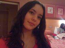
 <-- Click on the image
 After writing the contents I added three images to the page. The first, a photograph of myself, accompanying the letter form the editor. This decision was made due to the research analysis that I had done prior to the development of my magazine. I had recently discovered that a photograph of the editor if often included on the contents along with their few words speaking about the issue. The second image I added was another taken by myself of some of my friends posing as the T-Starz and their crew relaxing on their tour bus. This is an image that I was initially going to use in my article before I noticed that it didn't appear as clear as I would have likes. This was made more obvious to me after my media teacher mentioned it to me in my feedback after I handed in my first draft. The result of this was me choosing to transfer the image to the contents page where it would be smaller and placed in a more relevent place for such quality. The last image I added to the page was one of two male celebrity artists dancing at what appears to be a club. I accompanied this image with the caption just above explaining it and including a page reference.
Lastly, I further developed the page by adding a website address at the bottom alongside a catchy and appealing statement. The reason that I chose the background colour to be black is completely due to the fact that the colours of the text contrased much better with this than on a white background where they were barely visable.
No comments:
Post a Comment